Part III Capstone — Dependence, Stationarity, and Unit Roots
In Part III, we studied the core ideas that make time series analysis different from ordinary statistics.
We introduced:
randomness,
dependence,
autocorrelation,
stationarity,
ACF and PACF,
unit roots,
and differencing.
This capstone integrates these ideas using a practical workflow.
The goal is to move from visual inspection to formal diagnosis.
Learning Goals
By completing this capstone, you should be able to:
plot time series data
distinguish levels from differences
inspect persistence visually
compute and interpret ACF and PACF plots
perform a unit root test
transform nonstationary data using differencing
explain why stationarity matters before modeling
Dataset
We use the Thai SET Index as the main example.
Exercise 1 — Download and Plot the Series
import yfinance as yf
import matplotlib.pyplot as plt

set_index = yf.download(
    "^SET.BK",
    start="2018-01-01",
    auto_adjust=False
)

prices = set_index["Adj Close"].squeeze()

prices.plot(figsize=(10,4))

plt.title("Thai SET Index")
plt.xlabel("Date")
plt.ylabel("Index Level")

plt.savefig("figs/ch10_/set.png", dpi=300, bbox_inches="tight")
plt.close()   # replace with plt.show()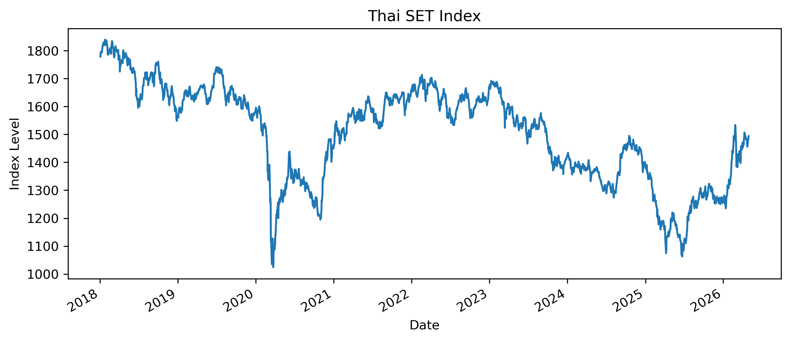
Questions
Does the series appear to fluctuate around a stable mean?
Does it appear persistent?
Are there obvious periods of sharp decline or recovery?
Exercise 2 — Compute Returns
import numpy as np

returns = 100 * np.log(
    prices / prices.shift(1)
)

returns = returns.dropna()

returns.plot(figsize=(10,4))

plt.title("Thai SET Index Log Returns")
plt.xlabel("Date")
plt.ylabel("Log Return (%)")

plt.savefig("figs/ch10_/rtn.png", dpi=300, bbox_inches="tight")
plt.close()   # replace with plt.show()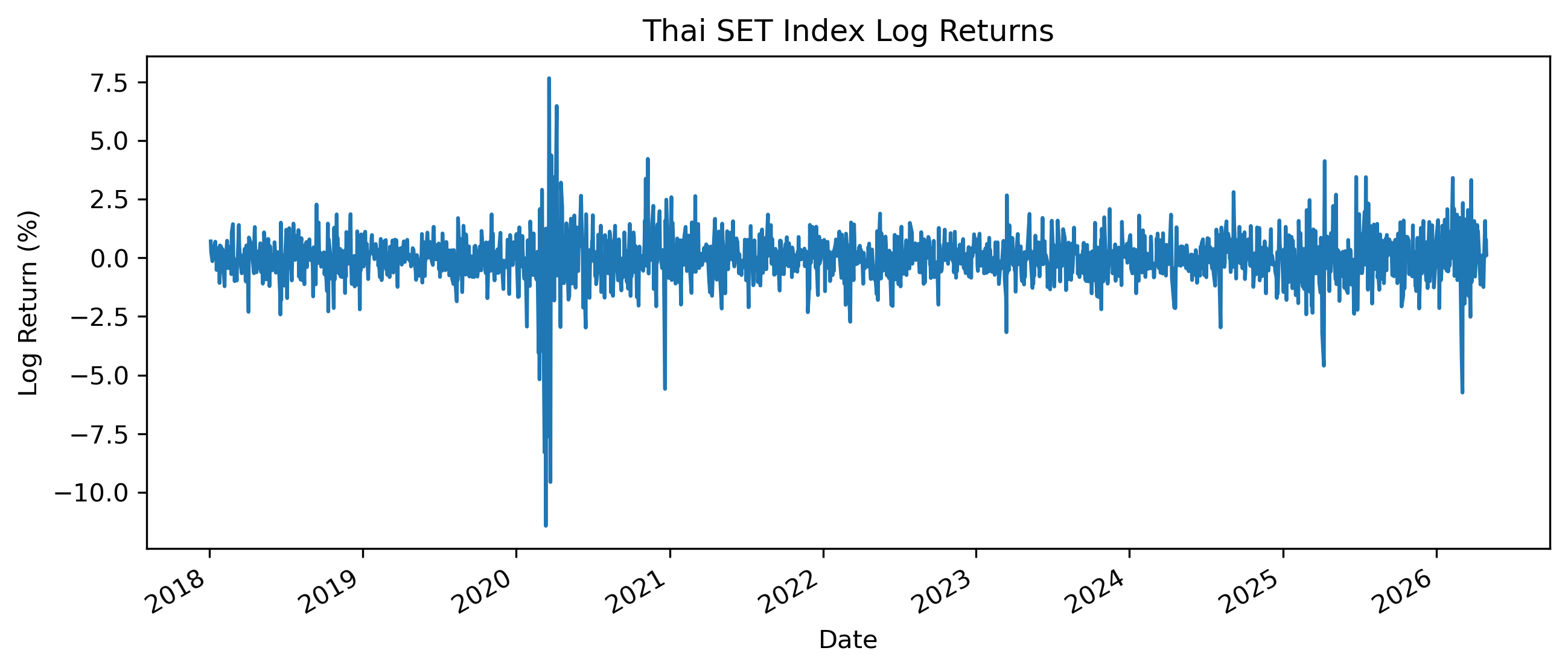
Questions
How does the return series differ from the price series?
Does the return series appear more stable?
Are there periods of high volatility?
Exercise 3 — Autocorrelation of Prices
We now examine the autocorrelation function of the price level.
from statsmodels.graphics.tsaplots import plot_acf

plot_acf(
    prices.dropna(),
    lags=40
)

plt.title("ACF of SET Index Level")

plt.savefig("figs/ch10_/acf.png", dpi=300, bbox_inches="tight")
plt.close()   # replace with plt.show()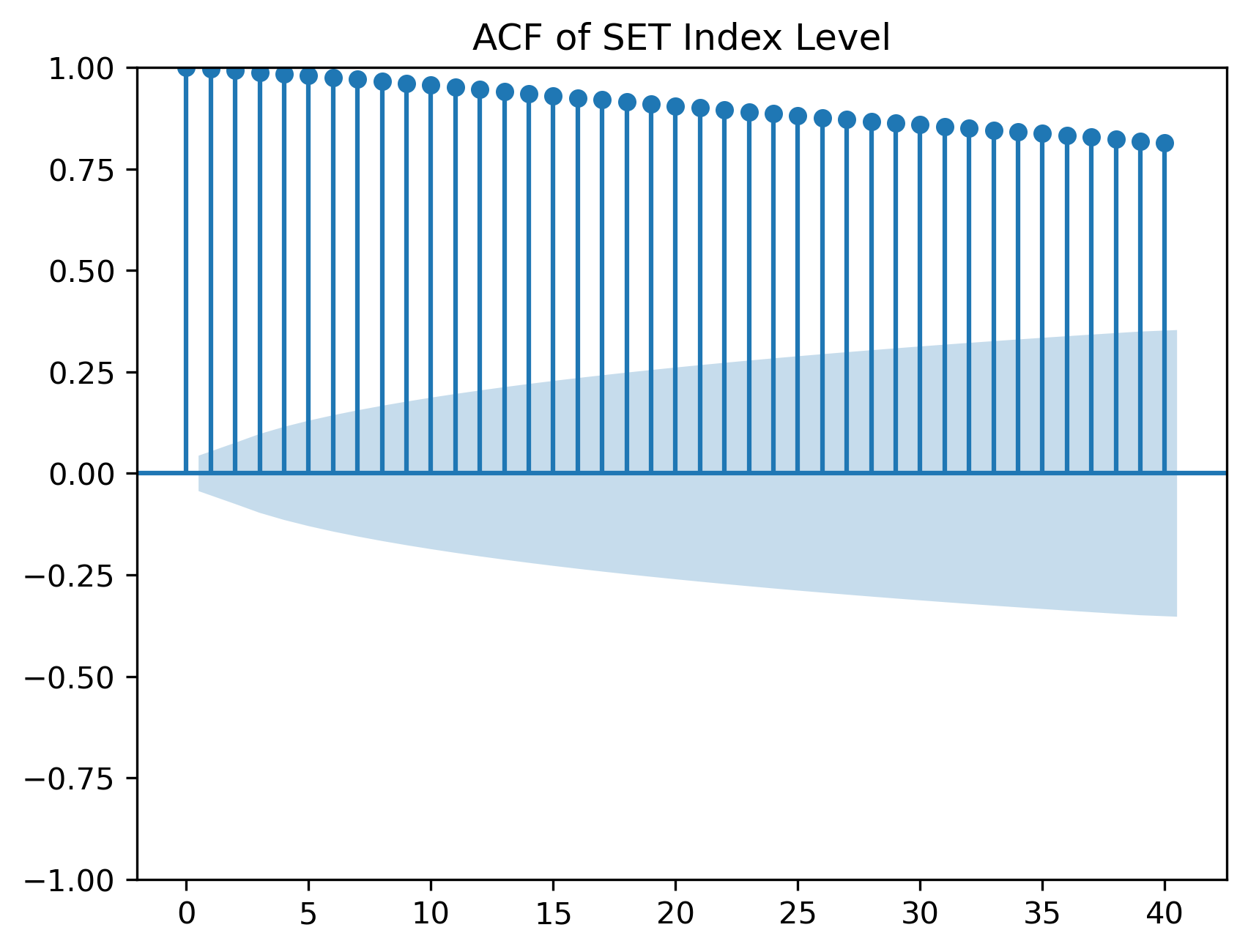
Questions
Do autocorrelations decline quickly or slowly?
What does slow decay suggest?
Why might persistent autocorrelation be a warning sign?
Exercise 4 — Autocorrelation of Returns
plot_acf(
    returns,
    lags=40
)

plt.title("ACF of SET Index Returns")

plt.savefig("figs/ch10_/acf_rtn.png", dpi=300, bbox_inches="tight")
plt.close()   # replace with plt.show()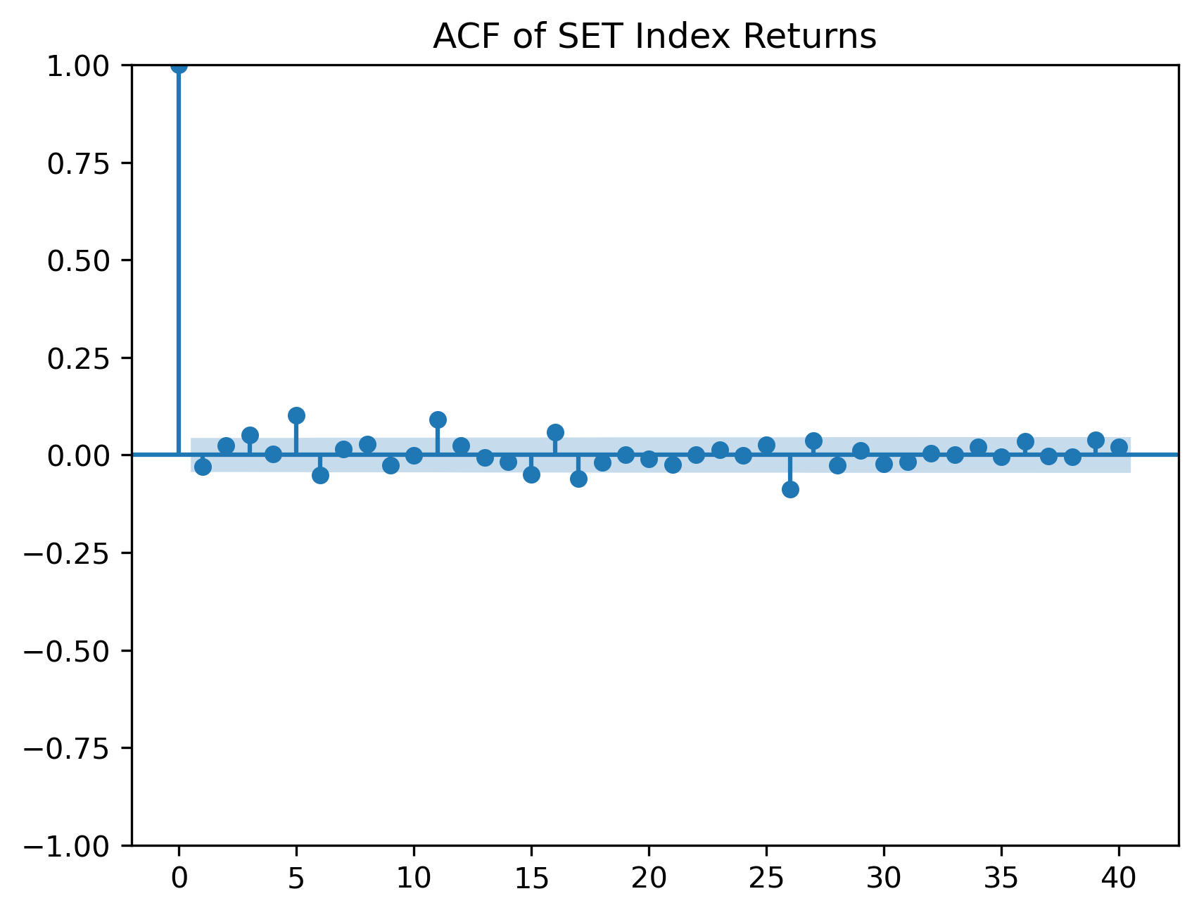
Questions
Are return autocorrelations smaller than price autocorrelations?
Do returns appear closer to white noise?
Are there any significant autocorrelations?
Exercise 5 — PACF of Returns
The partial autocorrelation function helps identify direct lag relationships.
from statsmodels.graphics.tsaplots import plot_pacf

plot_pacf(
    returns,
    lags=40,
    method="ywm"
)

plt.title("PACF of SET Index Returns")

plt.savefig("figs/ch10_/pacf_rtn.png", dpi=300, bbox_inches="tight")
plt.close()   # replace with plt.show()
Questions
Are there strong partial autocorrelations?
Would an AR model likely be useful for the mean of returns?
Why might returns be difficult to forecast?
Exercise 6 — Unit Root Test on Prices
We now perform the Augmented Dickey-Fuller test.
from statsmodels.tsa.stattools import adfuller

adf_price = adfuller(
    prices.dropna()
)

print("ADF Statistic:", adf_price[0])
print("p-value:", adf_price[1])
ADF Statistic: -2.477312904652193
p-value: 0.1210923683245807For raw/unfiltered results, which provides the critical values:
adfuller(prices.dropna())Questions
What is the null hypothesis of the ADF test?
Is the p-value small or large?
Do we reject the unit root null?
A large p-value means we fail to reject the possibility of a unit root.
Exercise 7 — Unit Root Test on Returns
adf_returns = adfuller(
    returns.dropna()
)

print("ADF Statistic:", adf_returns[0])
print("p-value:", adf_returns[1])
ADF Statistic: -10.62170495177763
p-value: 5.494107461809279e-19Questions
Is the return series more stationary than the price level?
How does the p-value compare with the price-level test?
Why does differencing often help with nonstationarity?
Exercise 8 — First Difference of Prices
Instead of log returns, we can also examine first differences.
price_diff = prices.diff().dropna()

price_diff.plot(figsize=(10,4))

plt.title("First Difference of SET Index")
plt.xlabel("Date")
plt.ylabel("Change in Index Level")

plt.savefig("figs/ch10_/fd.png", dpi=300, bbox_inches="tight")
plt.close()   # replace with plt.show()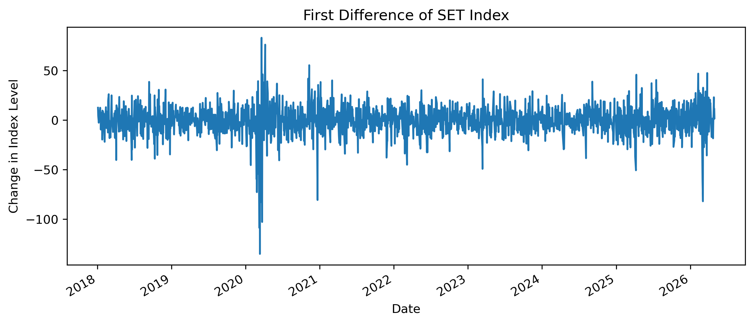
Questions
How does the first difference compare with log returns?
Does differencing remove the long-run trend?
Which transformation is easier to interpret financially?
Exercise 9 — Comparing Levels, Differences, and Returns
import pandas as pd

comparison = pd.DataFrame({
    "Level": prices,
    "First Difference": price_diff,
    "Log Return": returns
})

comparison.describe()
| | Level | First Difference | Log Return |
|-------|-------------|------------------|-------------|
| count | 2015.000000 | 2014.000000 | 2014.000000 |
| mean | 1504.308084 | -0.141430 | -0.008666 |
| std | 173.351414 | 13.984090 | 1.015393 |
| min | 1024.459961 | -134.979980 | -11.428184 |
| 25% | 1367.034973 | -7.194977 | -0.482559 |
| 50% | 1549.010010 | 0.205078 | 0.012854 |
| 75% | 1636.134949 | 7.457550 | 0.484997 |
| max | 1838.959961 | 83.050049 | 7.653075 |Questions
Which series has the largest scale?
Which series appears most stable?
Why should we avoid comparing standard deviations across variables with different units?
Exercise 10 — Rolling Mean and Rolling Variance
Stationarity requires more than a stable mean.
It also involves stable variance.
rolling_mean = returns.rolling(60).mean()
rolling_std = returns.rolling(60).std()

plt.figure(figsize=(10,4))

plt.plot(
    rolling_mean,
    label="Rolling Mean"
)

plt.plot(
    rolling_std,
    label="Rolling Standard Deviation"
)

plt.legend()

plt.title("Rolling Mean and Volatility of SET Returns")

plt.savefig("figs/ch10_/rolling.png", dpi=300, bbox_inches="tight")
plt.close()   # replace with plt.show()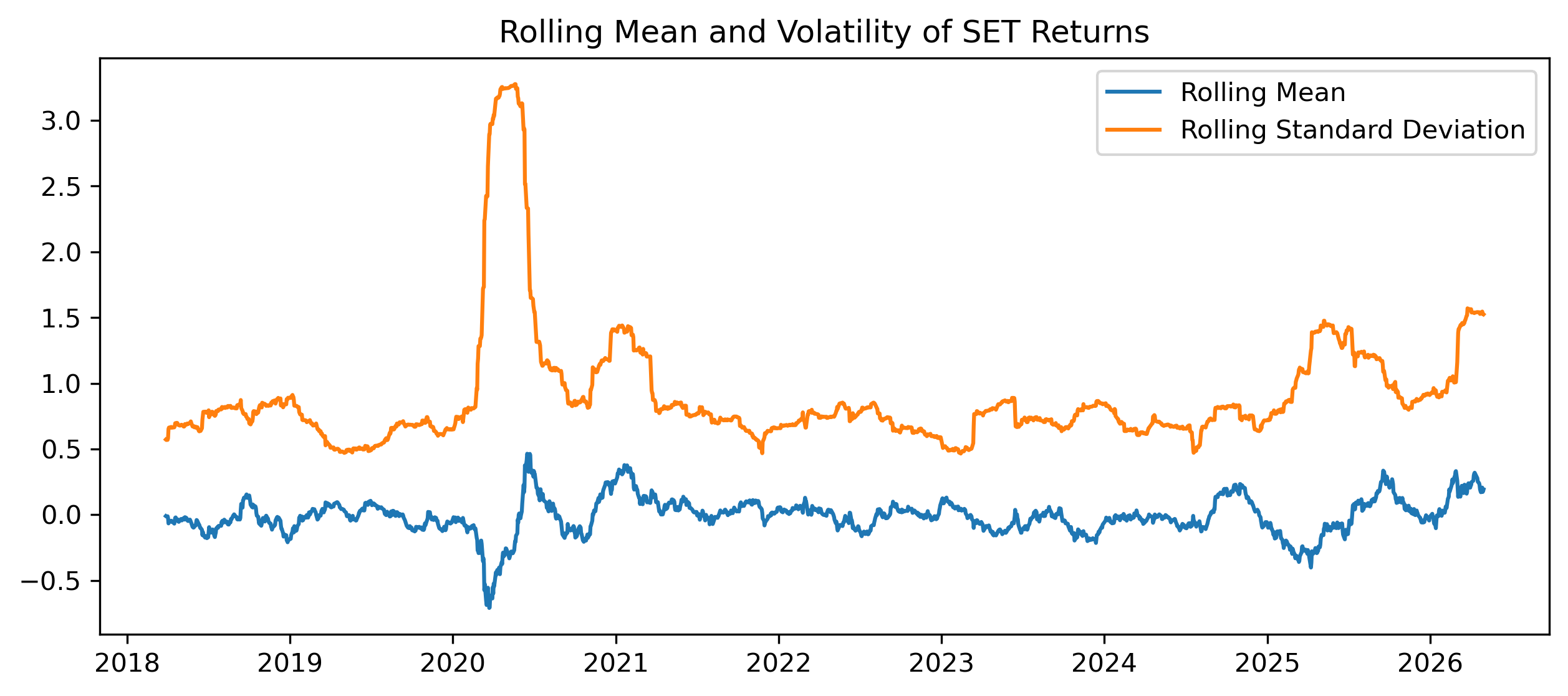
Questions
Is the rolling mean relatively stable?
Is the rolling standard deviation stable?
What does changing volatility suggest?
Exercise 11 — Simulating a Stationary AR(1)
Now compare the financial data with a simulated stationary process.
import numpy as np
import matplotlib.pyplot as plt

np.random.seed(123)

T = 500
phi = 0.6

e = np.random.normal(size=T)

x = np.zeros(T)

for t in range(1, T):
    x[t] = phi * x[t-1] + e[t]

plt.figure(figsize=(10,4))

plt.plot(x)

plt.title("Simulated Stationary AR(1) Process")

plt.savefig("figs/ch10_/AR_1.png", dpi=300, bbox_inches="tight")
plt.close()   # replace with plt.show()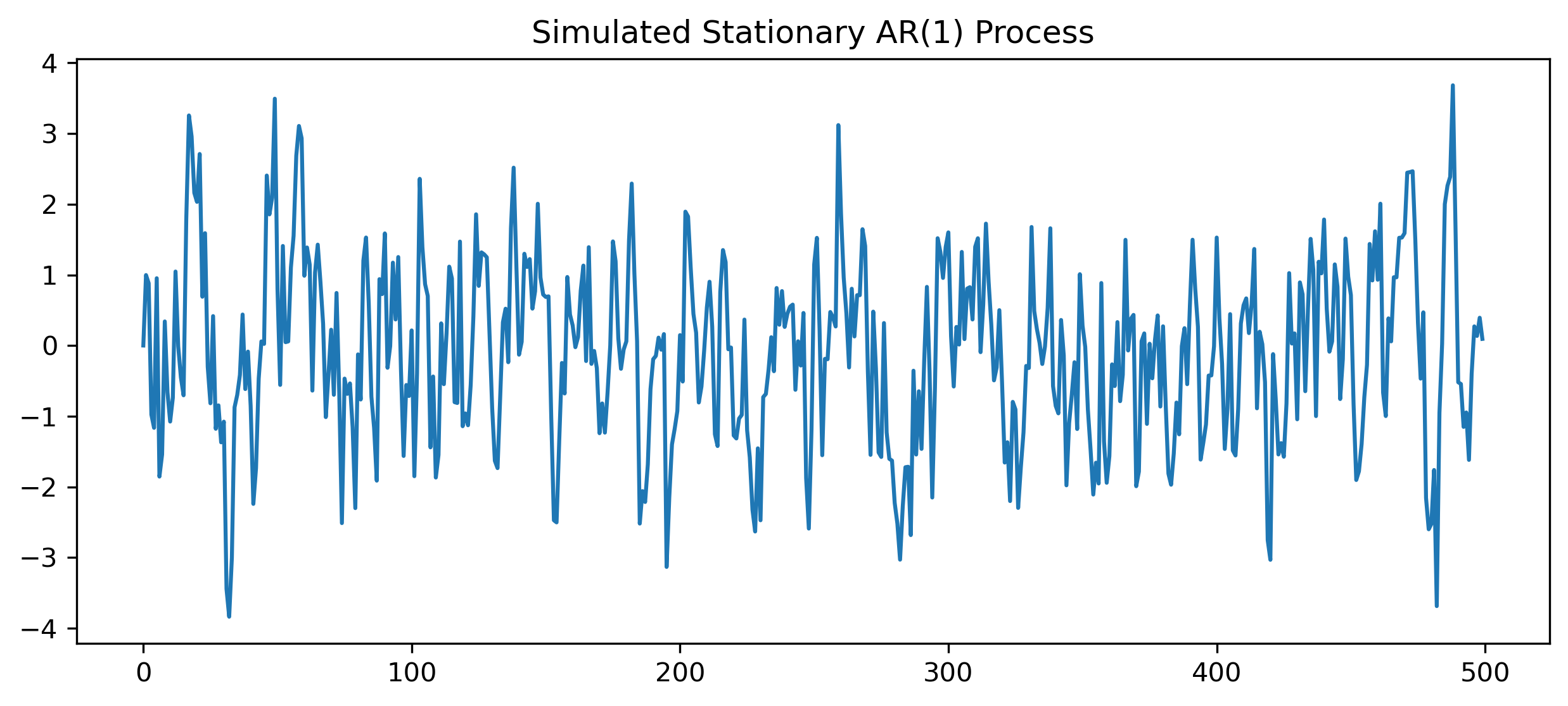
Questions
Does this series fluctuate around a stable mean?
Does it look different from the SET price level?
How does it compare with returns?
Exercise 12 — Simulating a Random Walk
np.random.seed(123)

T = 500

e = np.random.normal(size=T)

rw = np.cumsum(e)

plt.figure(figsize=(10,4))

plt.plot(rw)

plt.title("Simulated Random Walk")

plt.savefig("figs/ch10_/rw.png", dpi=300, bbox_inches="tight")
plt.close()   # replace with plt.show()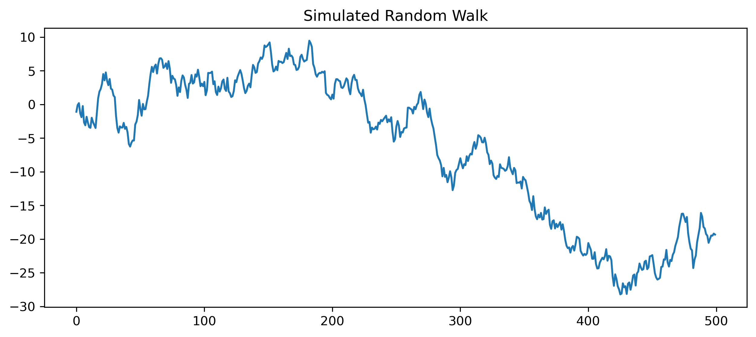
Questions
Does the random walk return to a stable mean?
Does it look more like prices or returns?
Why is a random walk difficult to forecast?
Mini Project — Diagnosing Stationarity
Choose one time series.
Examples:
SET Index,
Thai baht exchange rate,
CPI,
GDP,
Bitcoin,
gold prices,
oil prices.
Complete the following tasks:
Plot the level series.
Compute first differences or log returns.
Plot the transformed series.
Plot ACF and PACF.
Perform an ADF test on the level.
Perform an ADF test on the transformed series.
Compare the results.
Explain whether the original series appears stationary.
GRETL Version
The same workflow can be performed in GRETL.
Plotting the Series
Menu:
Variable → Time series plotFirst Difference
Menu:
Add → First differences of selected variablesor command:
diff xACF and PACF
Menu:
Variable → CorrelogramUnit Root Test
Menu:
Variable → Unit root tests → Augmented Dickey-Fuller test[GRETL Screenshot Placeholder: ADF test output]Common Mistakes
Looking Ahead
Part IV introduces linear time series models.
We will use the concepts developed in Part III to build:
AR models,
MA models,
ARMA models,
and ARIMA models.