Part I Capstone — Working with Financial Data
In Part I, we introduced:
time series data,
financial returns,
probability and uncertainty,
and the statistical foundations needed for later chapters.
This capstone integrates these ideas through a small applied project using real financial data.
The exercises below combine:
data collection,
visualization,
return calculations,
probability concepts,
and interpretation.
The goal is not only to compute statistics, but also to think economically about what the data represent.
Learning Goals
By completing this capstone, you should be able to:
download and organize financial data
compute simple and log returns
visualize prices and returns
interpret volatility
understand stylized facts of financial data
connect statistical concepts with financial interpretation
Background: Financial Time Series
Financial markets generate enormous quantities of time series data.
Examples include:
stock prices,
exchange rates,
interest rates,
commodity prices,
cryptocurrency prices.
Raw price data alone are often difficult to interpret statistically.
For this reason, analysts usually transform prices into:
Returns provide a more meaningful measure of financial performance and risk.
Dataset
We will use:
SET Indexthe ETF tracking the Thai SET index.
You may later replace this with:
S&P 500 index,
Korean KOSPI,
exchange rates,
or other assets.
Exercise 1 — Downloading and Visualizing Prices
We begin by downloading adjusted price data.
import yfinance as yf
import matplotlib.pyplot as plt

# Download SET Index data
set_index = yf.download(
    "^SET.BK",
    start="2018-01-01",
    auto_adjust=False
)

# Adjusted closing prices
prices = set_index["Adj Close"]

# Plot
prices.plot(figsize=(10,4))

plt.title("Thai SET Index Adjusted Closing Prices")

plt.ylabel("Index Level")

plt.xlabel("Date")

plt.savefig("figs/ch4_/set.png", dpi=300, bbox_inches="tight")
plt.close()   # replace with plt.show()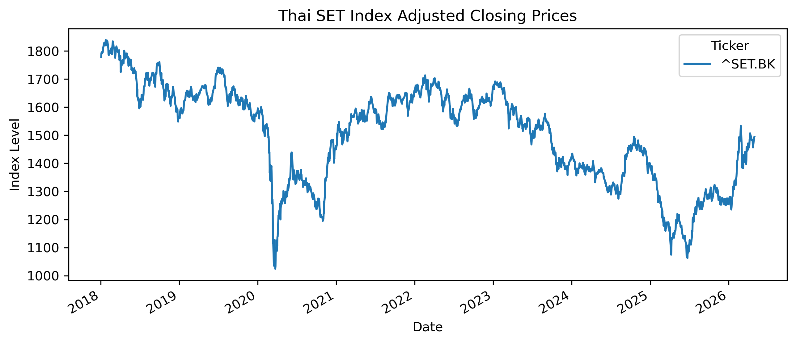
# Save CSV file
set_index.to_csv(
"figs/ch4_/set.csv")Questions
Does the series appear stationary?
Can you identify periods of:
rapid growth,
sharp decline,
unusual volatility?
Why might adjusted prices be preferable to raw prices?
Exercise 2 — Computing Returns
We now compute simple returns.
returns = prices.pct_change().dropna()

returns.head()
Plotting Returns
returns.plot(figsize=(10,4))

plt.title("SET Daily Returns")

plt.ylabel("Return")

plt.savefig("figs/ch4_/returns.png", dpi=300, bbox_inches="tight")
plt.close()   # replace with plt.show()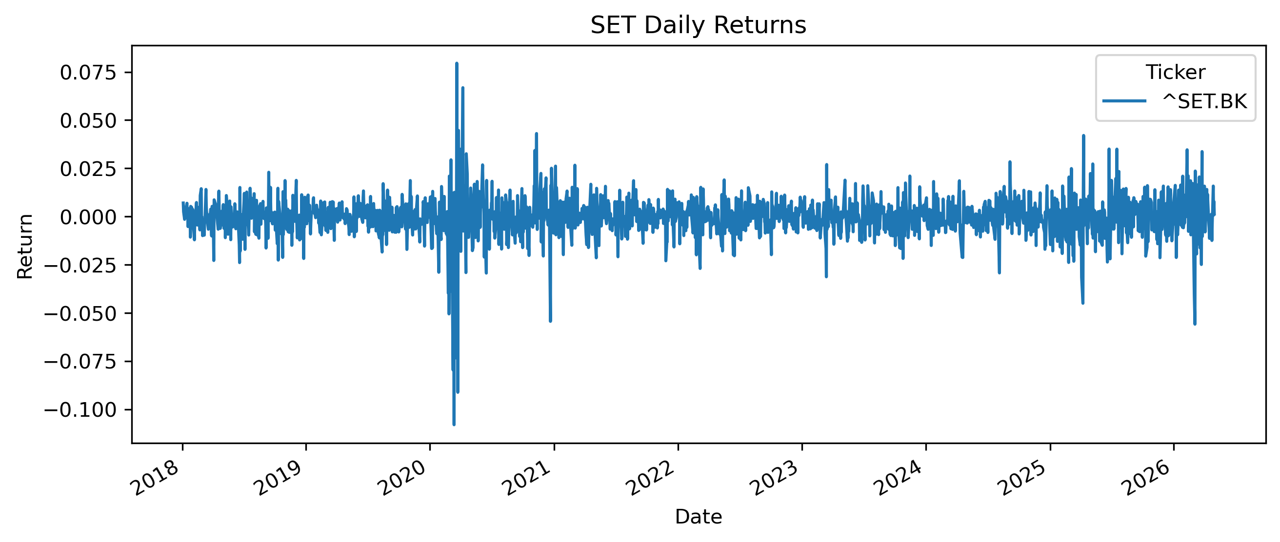
Questions
How does the return series differ visually from the price series?
Does the return series appear more stationary?
Can you identify periods of elevated volatility?
Exercise 3 — Simple vs Log Returns
We now compute log returns.
import numpy as np

log_returns = np.log(
    prices / prices.shift(1)
).dropna()

log_returns.head()
Comparing Returns
comparison = plt.figure(figsize=(10,4))

plt.plot(
    returns.index,
    returns,
    label="Simple Returns",
    alpha=0.7
)

plt.plot(
    log_returns.index,
    log_returns,
    label="Log Returns",
    alpha=0.7
)

plt.legend()

plt.title("Simple vs Log Returns")

plt.savefig("figs/ch4_/returns2.png", dpi=300, bbox_inches="tight")
plt.close()   # replace with plt.show()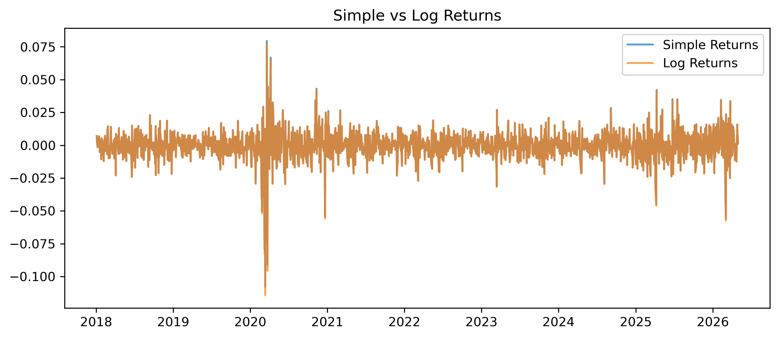
Questions
Are simple and log returns very different for daily data?
Why do economists and finance researchers often prefer log returns?
Under what circumstances might differences become larger?
Exercise 4 — Measuring Volatility
Volatility measures variability in returns.
One simple measure is the standard deviation.
Daily Volatility
returns.std()Rolling Volatility
rolling_vol = returns.rolling(30).std()

rolling_vol.plot(figsize=(10,4))

plt.title("30-Day Rolling Volatility")

plt.ylabel("Volatility")

plt.savefig("figs/ch4_/rol_vol.png", dpi=300, bbox_inches="tight")
plt.close()   # replace with plt.show()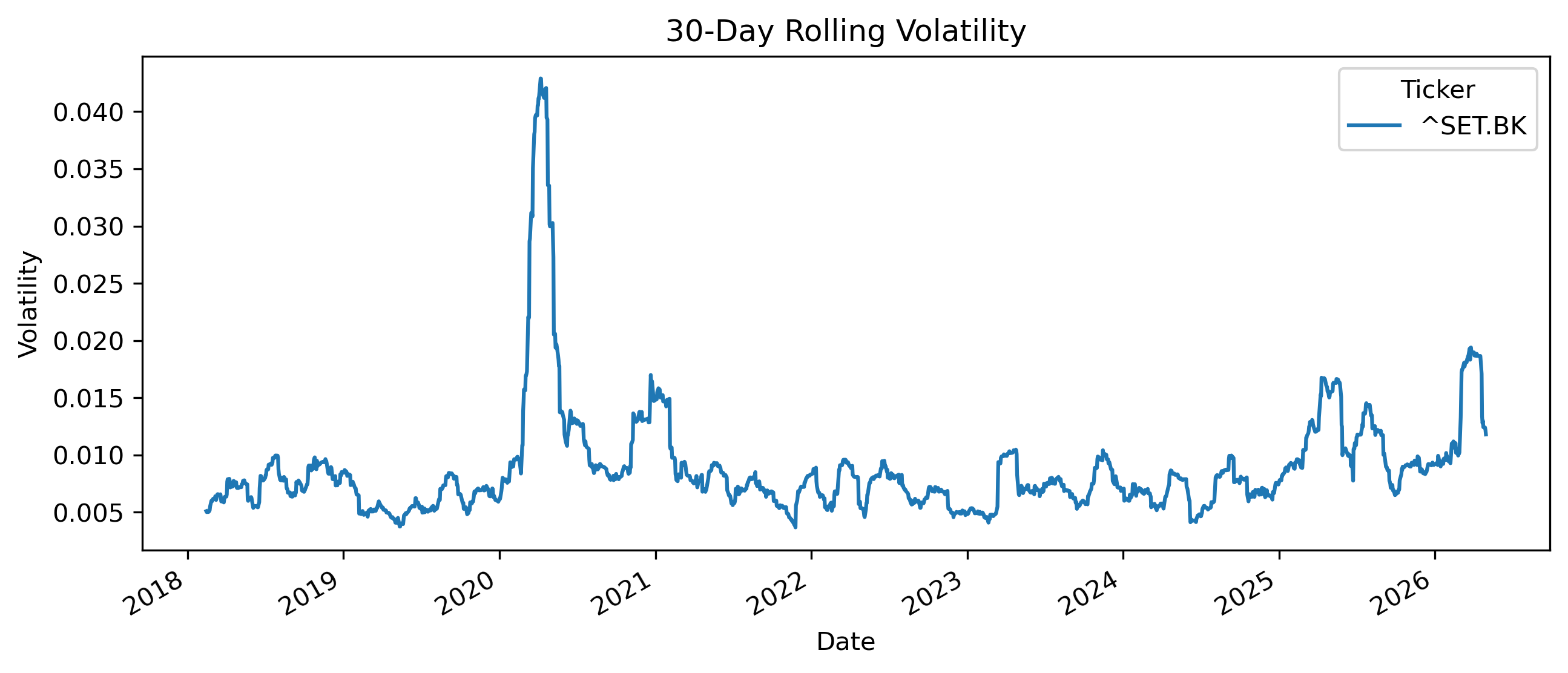
Questions
Does volatility appear constant over time?
Can you identify periods of volatility clustering?
Why might volatility matter for investors?
This becomes central later when we study:
ARCH models,
and GARCH models.
Exercise 5 — Distribution of Returns
We now examine the distribution of returns.
returns.hist(
    bins=50,
    figsize=(8,4)
)

plt.title("Distribution of Daily Returns")

plt.savefig("figs/ch4_/ret_dist.png", dpi=300, bbox_inches="tight")
plt.close()   # replace with plt.show()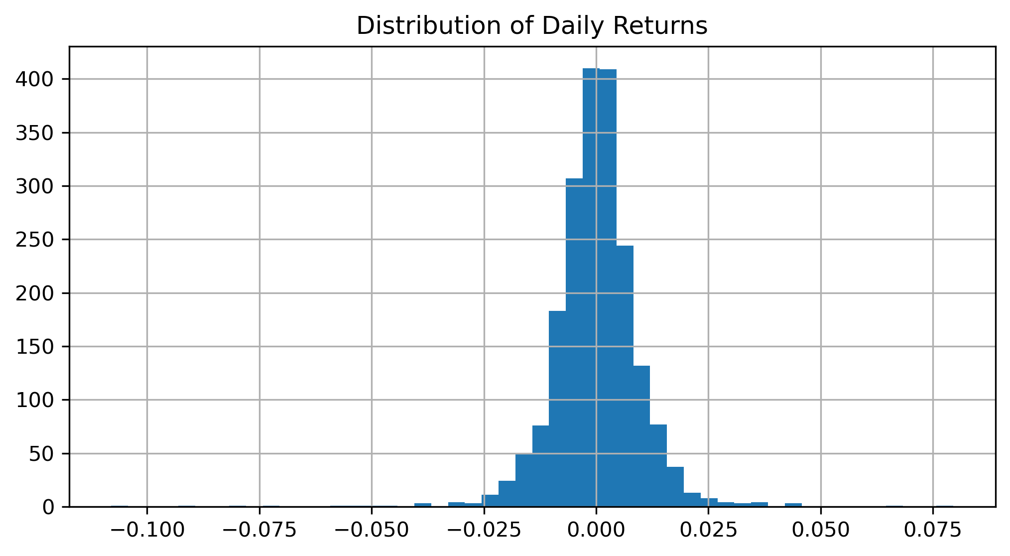
Questions
Does the distribution appear perfectly normal?
Are extreme observations present?
Why might extreme returns matter in finance?
Exercise 6 — Comparing Assets
We now compare multiple assets.
aapl = yf.download(
    "AAPL",
    start="2018-01-01",
    auto_adjust=False
)["Adj Close"]

nflx = yf.download(
    "NFLX",
    start="2018-01-01",
    auto_adjust=False
)["Adj Close"]

comparison = plt.figure(figsize=(10,4))

plt.plot(
    aapl / aapl.iloc[0],
    label="Apple"
)

plt.plot(
    nflx / nflx.iloc[0],
    label="NetFlix"
)

plt.legend()

plt.title("Normalized Stock Prices")

plt.show()
Questions
Why do we normalize prices before comparison?
Which asset performed better over the sample?
Which asset appears more volatile?
Exercise 7 — Short Selling and Negative Returns
Suppose an investor expects prices to fall.
One possible strategy is:
A short seller:
borrows an asset,
sells it today,
and hopes to repurchase it later at a lower price.
Example
Suppose:
| Day | Price |
|---|---|
| 1 | 100 |
| 2 | 90 |
Long Position Return
The investor loses 10%.
Short Position Return
The short seller gains 10%.
Questions
Why are short positions risky?
Why can short-selling losses become very large?
Why might short-selling be economically useful?
Exercise 8 — Interpreting Stylized Facts
Using the exercises above, identify examples of:
volatility clustering,
fat tails,
trends,
noise,
nonstationarity.
These patterns strongly influence modern time series modeling.
Mini Project — Exploring Thai Financial Data
Choose one Thai financial asset, such as:
SET Index,
SET50,
Thai baht exchange rate,
a major Thai stock.
Then:
Download the data.
Compute returns.
Plot prices and returns.
Measure volatility.
Compare simple and log returns.
Discuss stylized facts.
Gretl Version
The same exercises can also be performed in Gretl and/or Excel.
Downloading Data
Import CSV or Excel financial data.
Plotting Data
Menu:
Variable → Time series plotComputing Returns
Menu:
Add → Define new variableExample:
return = (P - P(-1))/P(-1)Or.
Right click on AdjClose and Add percent change...
Histogram
Menu:
Variable → Frequency distribution
Common Mistakes
Looking Ahead
Part II begins studying:
trends,
smoothing,
filtering,
and trading indicators.
We move from:
toward: