Chapter 4 — Visualizing Time Series
Before estimating models or producing forecasts, we should first look carefully at the data.
Visualization is one of the most important steps in time series analysis.
A graph often reveals features that summary statistics alone may hide.
This chapter introduces:
plotting time series,
trends,
cycles,
seasonality,
noise,
rolling averages,
and visual interpretation.
The emphasis is practical and intuition-first.
Learning Objectives
By the end of this chapter, you should be able to:
plot and interpret time series data
identify trends and cycles visually
distinguish signal from noise
recognize seasonality
understand rolling averages
compare multiple time series visually
use Python and Gretl to visualize data
4.1 Why Visualization Matters
Time series data often contain rich structure.
Plots may reveal:
trends,
volatility,
structural breaks,
outliers,
cycles,
persistence,
seasonality.
A model estimated without visual inspection may miss important features of the data.
4.2 A First Example
We begin with a simple example using stock market data.
import yfinance as yf
import matplotlib.pyplot as plt

sp500 = yf.download("^GSPC", start="2018-01-01", auto_adjust=False)

sp500["Adj Close"].plot(figsize=(10,4))

plt.title("S&P 500 Adjusted Closing Price")
plt.xlabel("Date")
plt.ylabel("Index Level")

plt.savefig("figs/ch4/sp500.png", dpi=300, bbox_inches="tight")
plt.close()   # replace with plt.show()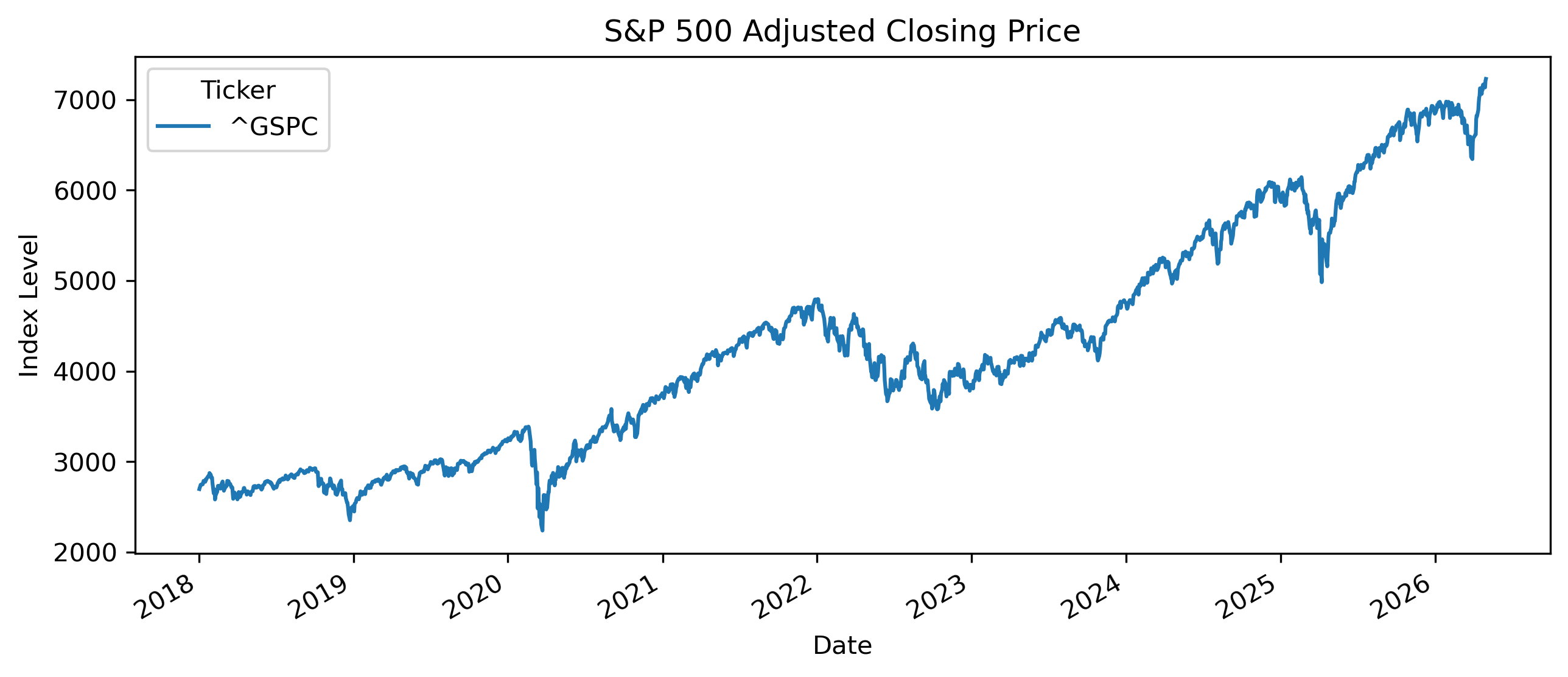
4.3 Components of a Time Series
Many time series contain several components.
A useful decomposition is:
Trend
A trend represents long-run movement.
Examples include:
long-run GDP growth,
rising stock market indices,
long-run inflation trends.
Cycles
Cycles are medium-run fluctuations around the trend.
Examples include:
business cycles,
housing cycles,
commodity cycles.
Seasonality
Seasonality refers to regular repeating patterns.
Examples include:
tourism seasons,
holiday shopping,
electricity demand,
agricultural harvest cycles.
Noise
Noise represents unpredictable random fluctuations.
4.4 Trends in Economic Data
Many macroeconomic variables display strong trends.
Examples include:
GDP,
population,
prices,
productivity.
Example: GDP
# !pip install pandas_datareader

import pandas_datareader.data as web
import matplotlib.pyplot as plt

thai_gdp = web.DataReader(
    "MKTGDPTHA646NWDB",
    "fred",
    start="2000-01-01"
)

thai_gdp.plot(figsize=(10,4))

plt.title("Thailand GDP")
plt.ylabel("Current U.S. Dollars")

plt.savefig("figs/ch4/thai_gdp.png", dpi=300, bbox_inches="tight")
plt.close()   # replace with plt.show()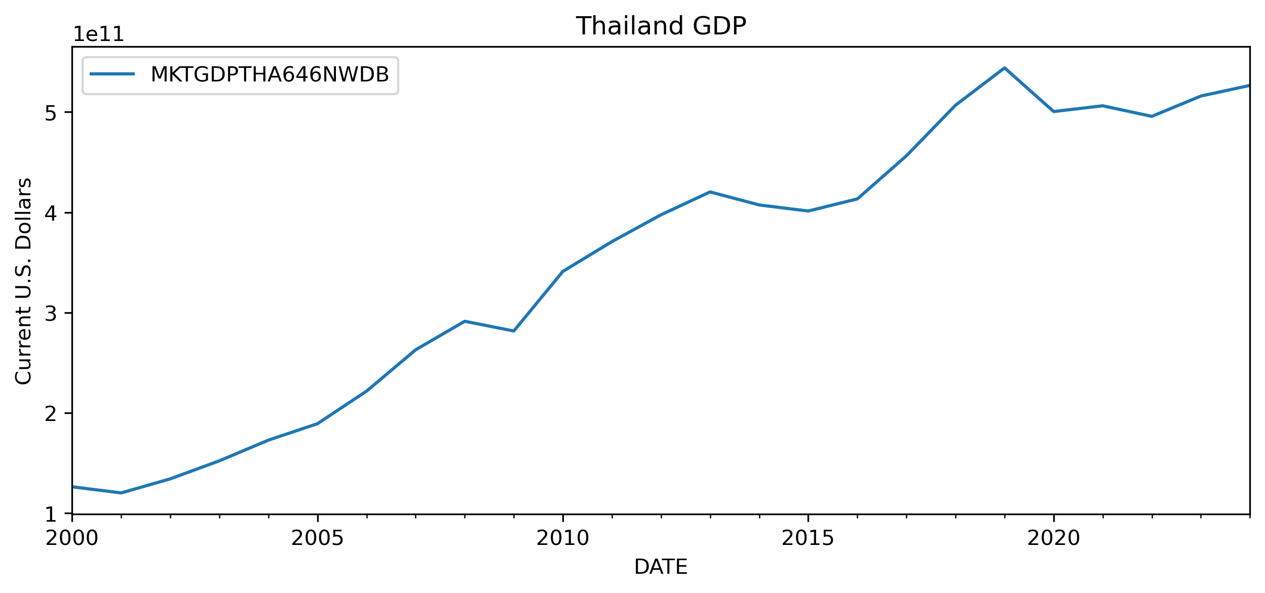
This has important implications for modeling and forecasting later in the book.
4.5 Trends vs Stationarity
Some time series fluctuate around relatively stable levels.
Others drift persistently upward or downward.
4.6 Seasonality
Seasonality refers to repeating patterns linked to the calendar.
Examples include:
higher retail sales during holidays,
tourism peaks,
electricity demand during summer,
agricultural cycles.
Example: Monthly Airline Passengers
# import matplotlib.pyplot as plt
import pandas as pd

url = "https://raw.githubusercontent.com/jbrownlee/Datasets/master/airline-passengers.csv"

df = pd.read_csv(url)

df["Passengers"].plot(figsize=(10,4))

plt.title("Monthly Airline Passengers")

plt.savefig("figs/ch4/airline.png", dpi=300, bbox_inches="tight")
plt.close()   # replace with plt.show()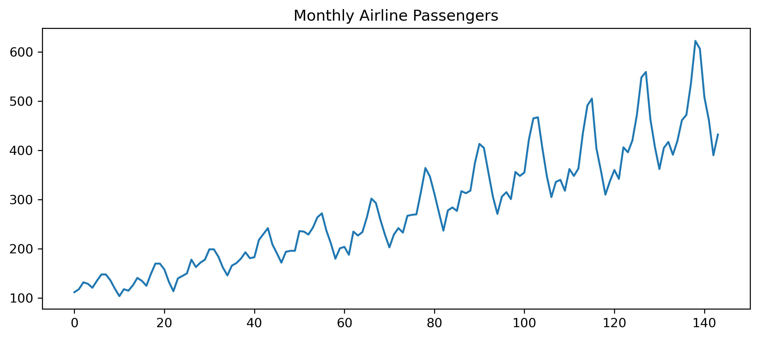
The fluctuations repeat systematically through time.
4.7 Cycles
Economic cycles differ from seasonality.
Seasonality repeats regularly.
Business cycles are more irregular.
Examples include:
recessions,
expansions,
commodity booms,
housing booms.
4.8 Noise and Random Fluctuations
Not all movements are meaningful.
Time series often contain substantial randomness.
This is especially important in finance.
Short-run market movements may contain substantial noise.
4.9 Visualizing Financial Returns
Prices and returns often behave very differently.
# import yfinance as yf
# import matplotlib.pyplot as plt
# import pandas as pd

aapl = yf.download("AAPL", start="2020-01-01", auto_adjust=False)

prices = aapl["Adj Close"]

returns = prices.pct_change()

fig, ax = plt.subplots(2,1, figsize=(10,7))

ax[0].plot(prices)
ax[0].set_title("Apple Adjusted Prices")

ax[1].plot(returns)
ax[1].set_title("Apple Daily Returns")

plt.tight_layout()

plt.savefig("figs/ch4/aapl.png", dpi=300, bbox_inches="tight")
plt.close()   # replace with plt.show()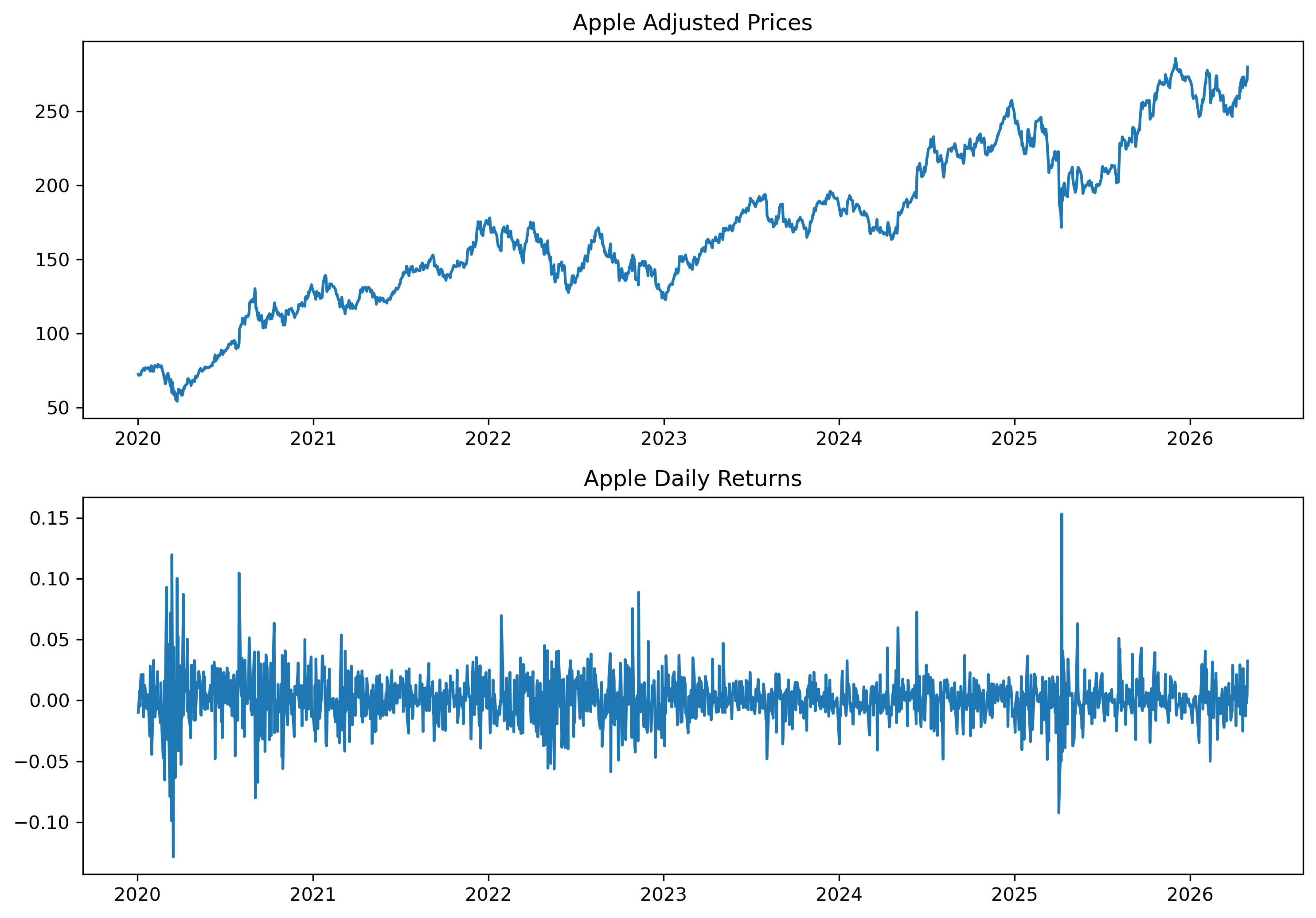
4.10 Volatility Clustering
Financial returns often display changing volatility.
Periods of calm are followed by periods of turbulence.
This phenomenon becomes central later in ARCH and GARCH models.
4.11 Structural Breaks
Some time series experience sudden changes.
These are called structural breaks.
Examples include:
financial crises,
policy regime changes,
pandemics,
wars.
Example
The COVID-19 pandemic caused dramatic movements in:
stock prices,
unemployment,
GDP,
exchange rates.
4.12 Rolling Averages
A rolling average smooths short-run fluctuations.
This helps reveal longer-run patterns.
Simple Rolling Average
A rolling average over periods is:
Example
# import yfinance as yf
# import matplotlib.pyplot as plt

aapl = yf.download("AAPL", start="2020-01-01", auto_adjust=False)

prices = aapl["Adj Close"]

ma50 = prices.rolling(50).mean()

plt.figure(figsize=(10,4))

plt.plot(prices, label="Price")

plt.plot(ma50, label="50-Day MA")

plt.legend()

plt.title("Apple Stock Price and Moving Average")

plt.savefig("figs/ch4/rolling.png", dpi=300, bbox_inches="tight")
plt.close()   # replace with plt.show()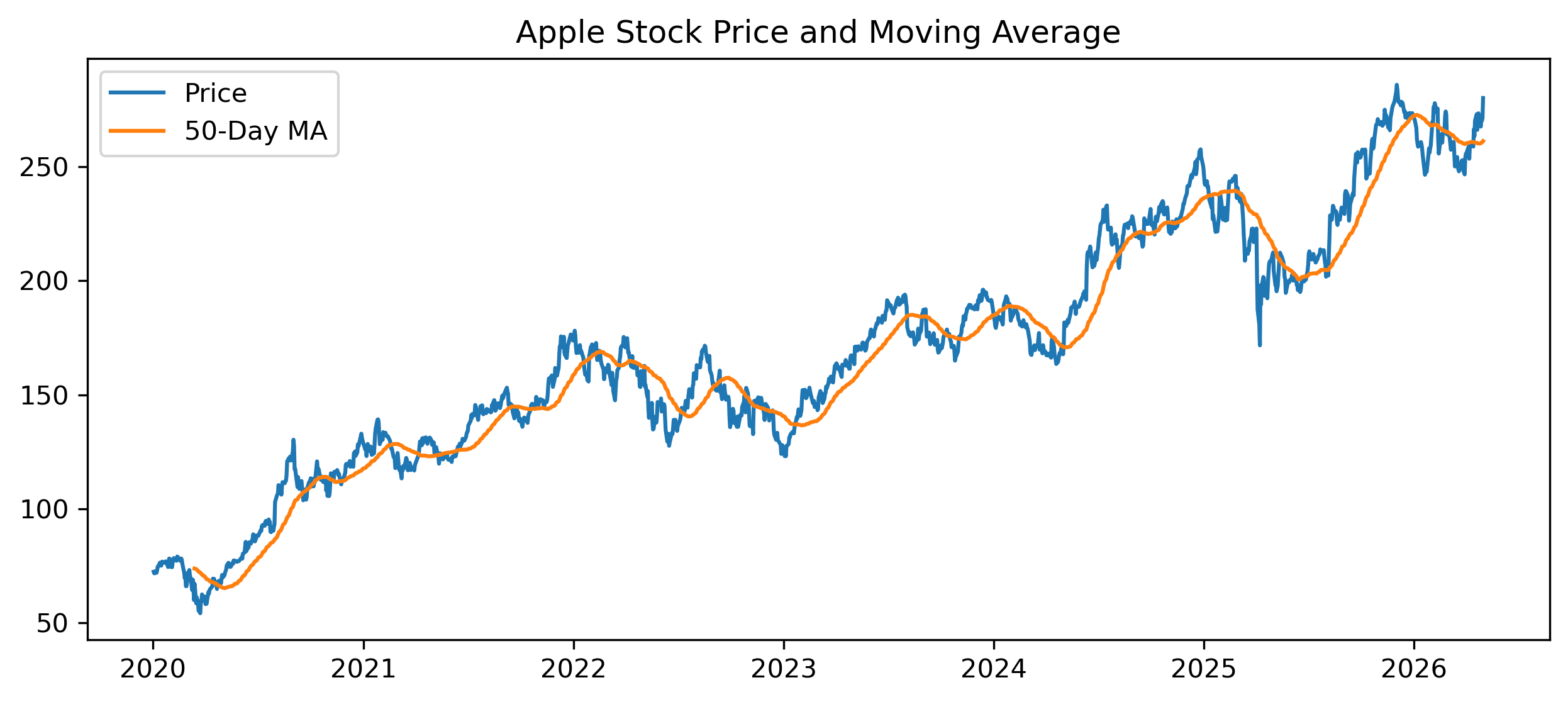
4.13 Comparing Multiple Series
Visualization also helps compare multiple variables.
# import yfinance as yf
# import matplotlib.pyplot as plt

aapl = yf.download("AAPL", start="2020-01-01", auto_adjust=False)["Adj Close"]

msft = yf.download("MSFT", start="2020-01-01", auto_adjust=False)["Adj Close"]

plt.figure(figsize=(10,4))

plt.plot(aapl / aapl.iloc[0], label="Apple")

plt.plot(msft / msft.iloc[0], label="Microsoft")

plt.legend()

plt.title("Normalized Stock Prices")

plt.savefig("figs/ch4/twostocks.png", dpi=300, bbox_inches="tight")
plt.close()   # replace with plt.show()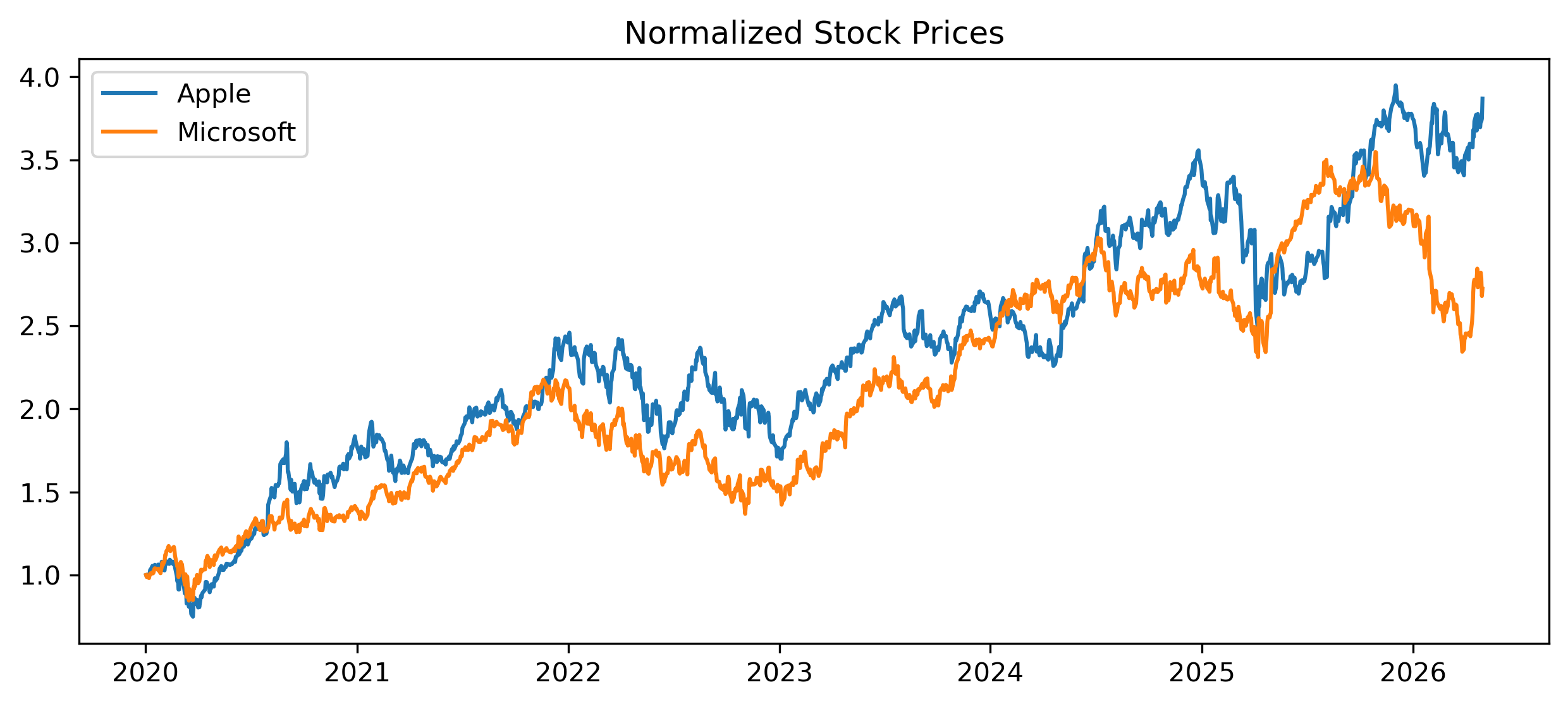
4.14 Log Scales
Some time series grow exponentially over long periods.
In such cases, log scales can improve interpretation.
Example
# import yfinance as yf
# import matplotlib.pyplot as plt

sp500 = yf.download("^GSPC", start="1990-01-01", auto_adjust=False)

plt.figure(figsize=(10,4))

plt.plot(sp500["Adj Close"])

plt.yscale("log")

plt.title("S&P 500 (Log Scale)")

plt.savefig("figs/ch4/logscale.png", dpi=300, bbox_inches="tight")
plt.close()   # replace with plt.show()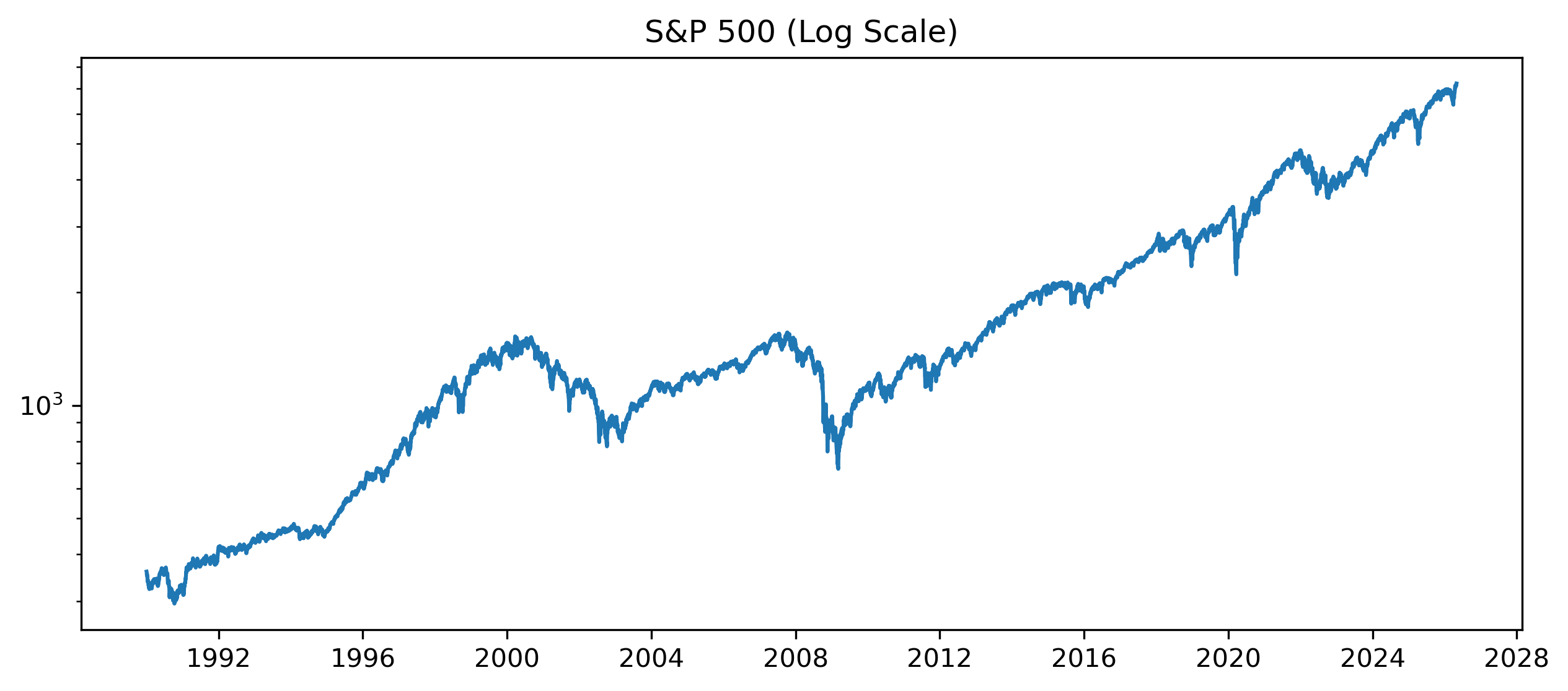
4.15 Visualization and Forecasting
Good forecasting begins with understanding the data visually.
Plots may reveal:
trends,
persistence,
seasonality,
changing volatility,
structural breaks.
These features influence model selection later.
4.16 Gretl Example: Plotting a Time Series
Gretl provides simple visualization tools.
Step 1 — Open Data
Menu:
File → Open dataStep 2 — Plot a Variable
Select a variable and choose:
Variable → Time series plot[GRETL Screenshot Placeholder: Time series plot]Step 3 — Add Moving Average
Menu:
Add → Moving average[GRETL Screenshot Placeholder: Moving average plot]4.17 Common Mistakes
4.18 Looking Ahead
This chapter introduced visual exploration of time series data.
The next chapter studies smoothing and trend estimation more formally.
We will examine:
moving averages,
exponential smoothing,
Holt models,
HP filters,
and trend extraction.
Key Takeaways
Concept Check
Basic
What is the purpose of plotting a time series?
What is a trend?
What is a cycle?
Intuition
Why is visualization often the first step in time series analysis?
How can a plot help detect patterns that summary statistics cannot?
What is the difference between signal and noise?
Intermediate
What does a moving average do to a time series?
Why does smoothing help reveal underlying patterns?
What is the trade-off between smoothing and responsiveness?
Challenge
Suppose a time series appears smooth after applying a moving average.
What information might be lost?
Why might this matter for forecasting or trading?
Interpretation & Practice
You observe a time series plot with a steady upward movement.
What feature does this suggest?
Why might this create problems for analysis later?
A time series fluctuates randomly around a constant level.
What type of behavior does this suggest?
What might be a suitable model for this?
A time series shows long periods of calm followed by sudden large movements.
What feature of financial data does this illustrate?
Why is this important?
A smoothed series (moving average) lags behind the original data.
Why does this happen?
When might this be a problem?
Challenge
Two analysts use different moving averages:
Analyst A: 5-day MA
Analyst B: 50-day MA
Which one reacts faster to new information?
Which one is smoother?
Which one would be better for short-term trading?
Numerical Practice
Visual Thinking
Consider the following simulated time series:
Source
import numpy as np
import matplotlib.pyplot as plt

np.random.seed(0)

t = np.arange(100)

trend = 0.1 * t
noise = np.random.normal(0, 1, 100)

series = trend + noise

plt.plot(series)
plt.title("Simulated Trend + Noise")

plt.savefig("figs/ch3/Q_trent.png", dpi=300, bbox_inches="tight")
plt.close()   # replace with plt.show()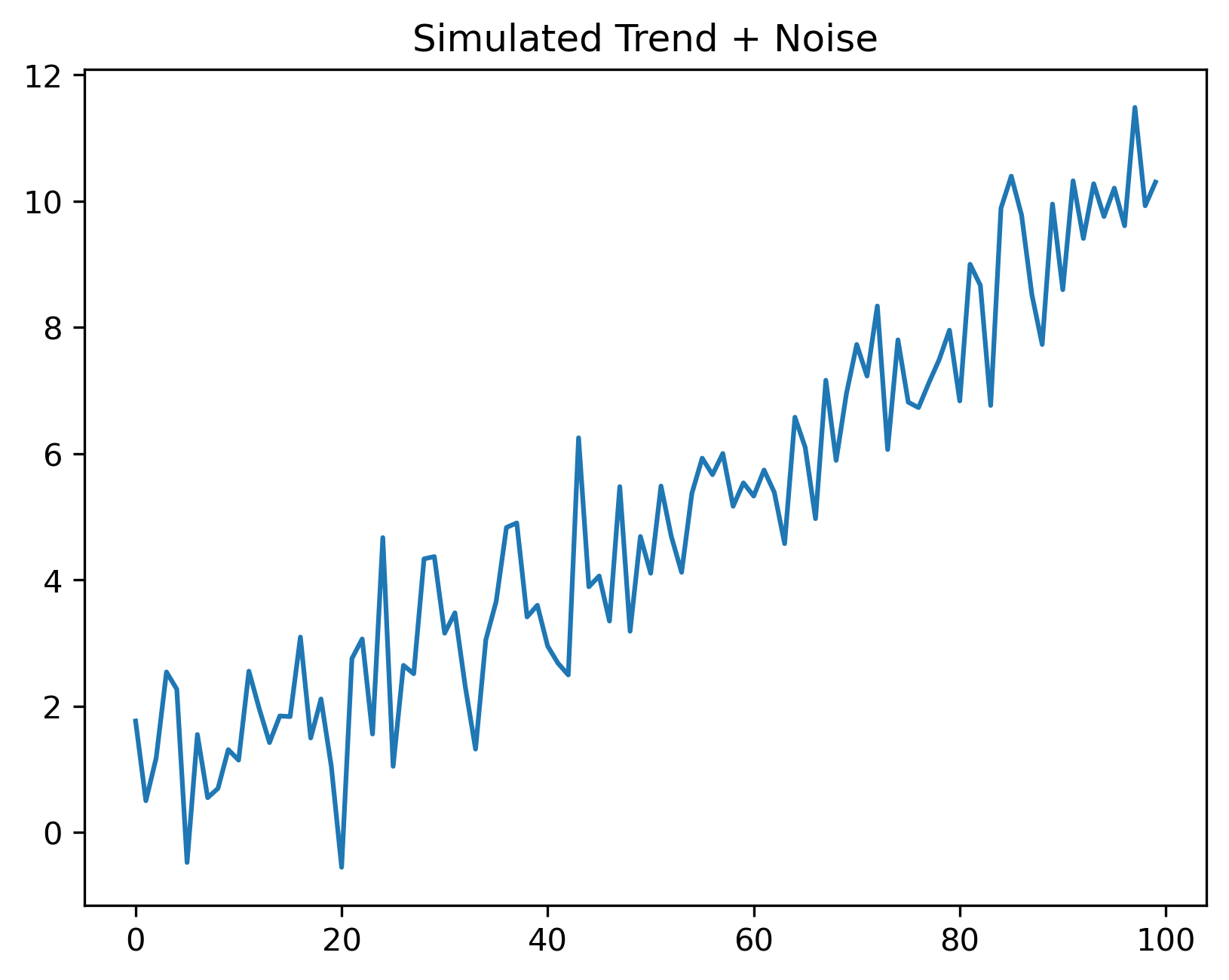
What two components can you identify?
Which part represents signal? Which part represents noise?
Smoothing a Stationary Series
Simulate a stationary AR(1) series:
Source
import numpy as np
import matplotlib.pyplot as plt

np.random.seed(0)

T = 150
phi = 0.7

e = np.random.normal(0, 1, T)

series = np.zeros(T)

for t in range(1, T):
    series[t] = phi * series[t-1] + e[t]

plt.plot(series)

plt.title("Simulated Stationary AR(1) Series")

plt.savefig("figs/ch3/Q_ar1.png", dpi=300, bbox_inches="tight")
plt.close()   # replace with plt.show()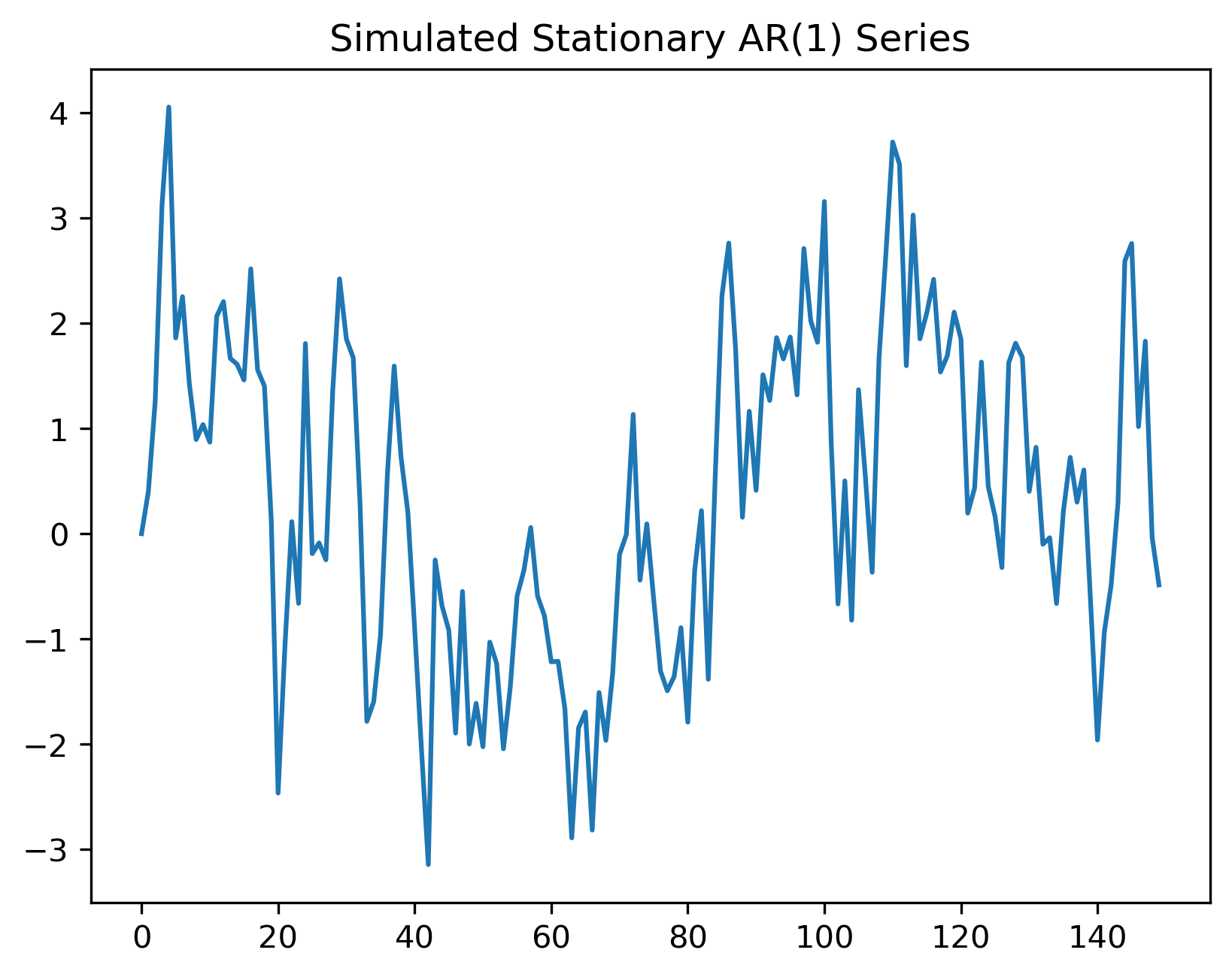
Does the series have a deterministic trend?
Does it still show persistence?
How is this different from pure white noise?
Apply moving averages to the AR(1) series:
Source
ma_short = np.convolve(series, np.ones(5)/5, mode="valid")

ma_long = np.convolve(series, np.ones(20)/20, mode="valid")

plt.plot(series, alpha=0.3, label="Original AR(1)")

plt.plot(
    range(4, T),
    ma_short,
    label="5-period MA"
)

plt.plot(
    range(19, T),
    ma_long,
    label="20-period MA"
)

plt.legend()

plt.title("Smoothing a Stationary AR(1) Series")

plt.savefig("figs/ch3/Q_ar1_ma.png", dpi=300, bbox_inches="tight")
plt.close()   # replace with plt.show()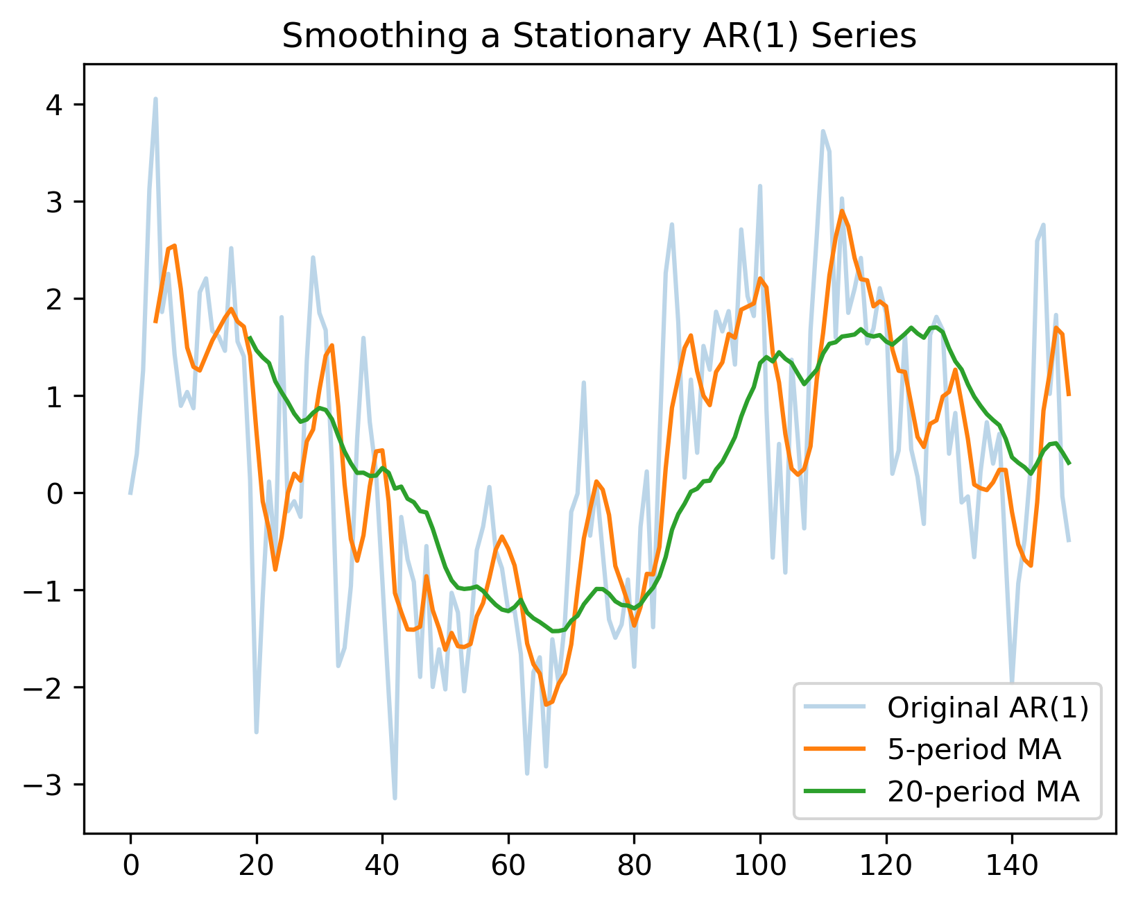
Which moving average is smoother?
Which responds faster to changes?
What is the danger of smoothing too heavily?